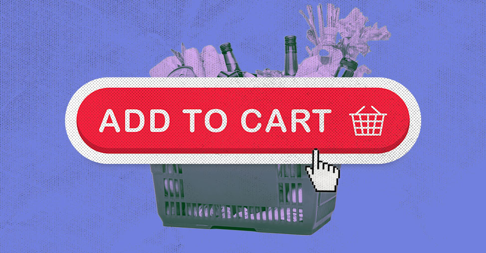
Struggling with an e-commerce website that isn’t generating sales? One crucial design element could be the key to turning your website into a profitable venture: the Add-to-Cart button. This seemingly simple feature can significantly enhance your conversion rates and transform casual visitors into loyal customers.
In 2023, customer engagement is about more than just attracting visitors—it’s about driving revenue. The Add-to-Cart button plays a pivotal role in the customer’s purchasing journey by making the buying process seamless and efficient.
What is the Add-to-Cart Button?
The Add-to-Cart button is a small, eye-catching feature on e-commerce sites that allows customers to easily add products to their shopping carts. It’s more than just a standard UX button; it’s a strategically designed element crucial for a smooth shopping experience.
Designing the Perfect Add-to-Cart Button
1. Choose the Right Color: Opt for a color that stands out from the rest of your website’s design to draw attention. Contrasting colors and larger sizes can make your button more noticeable.
2. Use Stylish Elements: Enhance the button’s appeal with bold design features. Consider adding a 3D effect, thin borders, or subtle shadows. An arrow icon can also clarify the action for users.
3. Strategic Placement: Position the button where it’s most likely to be seen. Consider placing it below product images or next to the price tag to ensure it’s visible on all devices.
4. Add a Mini Cart: Show a summary of items in the cart with an expandable mini cart. This feature helps users keep track of their purchases and encourages impulse buying.
5. Regular Testing: Continuously test and refine your button’s usability. Gather user feedback to ensure it’s effective and free of bugs.
6. Handle Out-of-Stock Items: Automatically update the button text to “Out of Stock” or “Sold Out” when items are unavailable. This prevents frustration and maintains a positive user experience.
7. Minimize Clutter: Ensure the button stands out by keeping the surrounding area clean and uncluttered. A well-spaced button is more inviting.
8. Experiment with Text: While “Add to Cart” is standard, try alternatives like “Buy Now” to see which performs better in driving conversions.
9. Opt for Rounded Corners: Rounded buttons are often more appealing and user-friendly compared to those with sharp edges.
10. Ensure Mobile Friendliness: Make your Add-to-Cart button mobile-friendly by anchoring it at the bottom of the screen. This ensures it remains accessible as users scroll.
How the Add-to-Cart Button Enhances Conversions
An effective Add-to-Cart button simplifies the shopping process, especially on mobile devices. It reduces the steps needed to complete a purchase, making it easier for users to convert from visitors to customers. Properly designed buttons can also minimize cart abandonment and streamline the checkout experience.
Strengthening Your Branding with Add-to-Cart Buttons
To reduce cart abandonment, place the button strategically and provide a straightforward checkout process. Encourage customers to save their details for future purchases and combine special offers with the button to boost sales.
Top 10 Add-to-Cart Button Design Inspirations
- Color Choice: Use contrasting colors to make your button stand out.
- Design Elements: Incorporate bold fonts and 3D effects for visual appeal.
- Placement: Position the button where it’s most visible and accessible.
- Mini Cart: Display a summary of items and include a checkout option.
- Usability Testing: Regularly test and gather feedback to improve the button.
- Out-of-Stock Notifications: Update the button text for unavailable items.
- Clutter-Free Design: Ensure the button is surrounded by white space.
- Text Variation: Test different button texts to find what works best.
- Rounded Corners: Use rounded edges to make the button more inviting.
- Mobile Optimization: Make the button accessible and visible on mobile devices.
Conclusion
Optimizing your Add-to-Cart button is a critical step in enhancing your e-commerce site’s performance. By making the button attractive and functional, you can improve the user experience, reduce cart abandonment, and boost your overall sales. Remember, the goal is not just to get users to click the button but to guide them smoothly through the entire purchase process.

